Wall color is not just a matter of taste, it is a decision that directly shapes your sleep, focus and mood every single day. When you plan painting your home, choosing colors based on each room's psychological function is what separates a space that simply looks good from one that actually makes you feel good. This guide walks through why color psychology should drive your decisions room by room, from the bedroom to the home office.
What is color psychology and why does it matter?
Color psychology studies how different tones influence our emotions, behavior and perception of space. According to Wikipedia, warm colors such as red and orange tend to raise stimulation and energy, while cool colors such as blue and green have a calming effect on the nervous system. This basic principle of color temperature is the foundation for every good color decision inside a home.
Beyond temperature, light reflectance value (LRV) matters just as much. Colors with an LRV above 60 bounce back most of the light that hits them, making a small room feel more open, while tones with an LRV below 20 absorb light and create intimacy but also a cramped feeling if the room is already small. In typical Tirana and Durres apartments, where bedrooms often run 12 to 16 square metres and kitchens 8 to 10 square metres, this practical detail directly affects how spacious a room feels.
Which paint color calms a bedroom the most?
Cool, muted tones such as pale blue, light gray or sage green are the best choice for a bedroom, because they lower visual stimulation and support the body's natural sleep rhythm. These shades typically carry an LRV above 60, reflecting light and making an average Albanian bedroom feel wider than it actually is.
Lavender blue and sage green work especially well when paired with warm 2700K LED lighting, because the warm light neutralizes the excess coolness of the color and creates a comfortable balance. If your bedroom already has a gypsum ceiling with cove lighting, as described in our guide to gypsum works for bedrooms, choose a wall color that complements the existing warm light temperature rather than fighting it.
For the finish, matte is the standard choice for bedrooms. Matte paint hides small wall imperfections and avoids the harsh reflections that can disrupt a calm nighttime atmosphere. Avoid saturated colors like deep red or dark purple, which raise heart rate and make it harder to relax before sleep.
Which colors energize a kitchen without overwhelming the space?
Kitchens benefit from warm, controlled tones such as soft terracotta, muted mustard yellow or translucent orange, because these colors stimulate appetite and create a social atmosphere for the family. Unlike a bedroom, a kitchen is an activity space, so it tolerates higher visual stimulation without feeling heavy.
The practical rule for Albanian kitchens, typically 8 to 10 square metres, is to limit the warm color to one accent wall or the lower half of the walls, while the rest stays a light neutral tone to balance the visual energy. The most common 2026 pairing is a terracotta accent wall with warm gray or off-white kitchen cabinetry.
Finish matters as much as color in a kitchen. A satin or semi-gloss finish is always recommended because it resists moisture, steam and grease splatters, and wipes clean easily with a damp cloth. Matte, although elegant, stains quickly in a kitchen and is not suitable for walls or panels near the stove. Plan on two coats of paint with 2 to 4 hours of drying time between coats, especially when switching from a dark color to a lighter one.
Which paint color helps you focus in a home office?
Sage green and soft blue are the most effective colors for a home office, because they are cool tones that reduce visual stimulation and support concentration across long working hours. An eggshell or low-sheen finish reinforces this effect by cutting down on distracting glare from a computer screen throughout the day.
In Tirana apartments, a home office is often carved out of a small spare room or an enclosed balcony nook, typically 8 to 10 square metres. In these tight spaces, avoid very dark colors that absorb light and make the room feel closed in after a few hours of work. Instead, choose a light base tone with an LRV above 55 and add a deep blue or forest green accent wall only if the room has large windows that bring in enough natural light to balance it.
Color psychology research consistently finds that bright red and orange raise heart rate and blood pressure, which is useful in a gym but counterproductive in a space meant for sustained focus. If your office also doubles as a video call background, a calm, non-distracting neutral or cool tone is a practical bonus of these softer colors.
Which colors work best for a kids' room?
A kids' room needs a balance between stimulation and calm, so we recommend a light pastel base (sky blue, mint green or dusty pink) combined with one more saturated accent wall rather than covering the whole room in bold color. This approach allows energy and creativity without overstimulating the space to the point of disrupting sleep.
Finish choice matters a great deal here. A washable satin finish resists stains from paint, crayons and handprints, and wipes clean without damaging the underlying color, unlike matte, which holds onto stains permanently. Always use low-VOC paint (low volatile organic compounds) for a kids' room, since this reduces odor and off-gassing during the first few months after painting.
If you are also planning gypsum elements for the room, such as decorative ceiling shapes or color-changing LED lighting, this pairs particularly well with the pastel wall base described above, creating a cohesive, complete-feeling space.
Which colors create a welcoming atmosphere in a living room?
The living room benefits more than any other room from warm, social tones such as softened terracotta, mustard yellow or warm beige, because these colors encourage conversation and create a welcoming feel for family and guests. Unlike a bedroom or office, a living room is meant for social energy rather than pure calm.
Lighting plays a major role in how a living room's wall color is perceived in the evening. A pendant fixture hung over the seating area or dining zone changes the perceived temperature of the wall behind it: under warm 2700K to 3000K light, even a neutral gray takes on soft warm undertones, while under cooler light above 4000K, the same wall reads more distant and clinical.
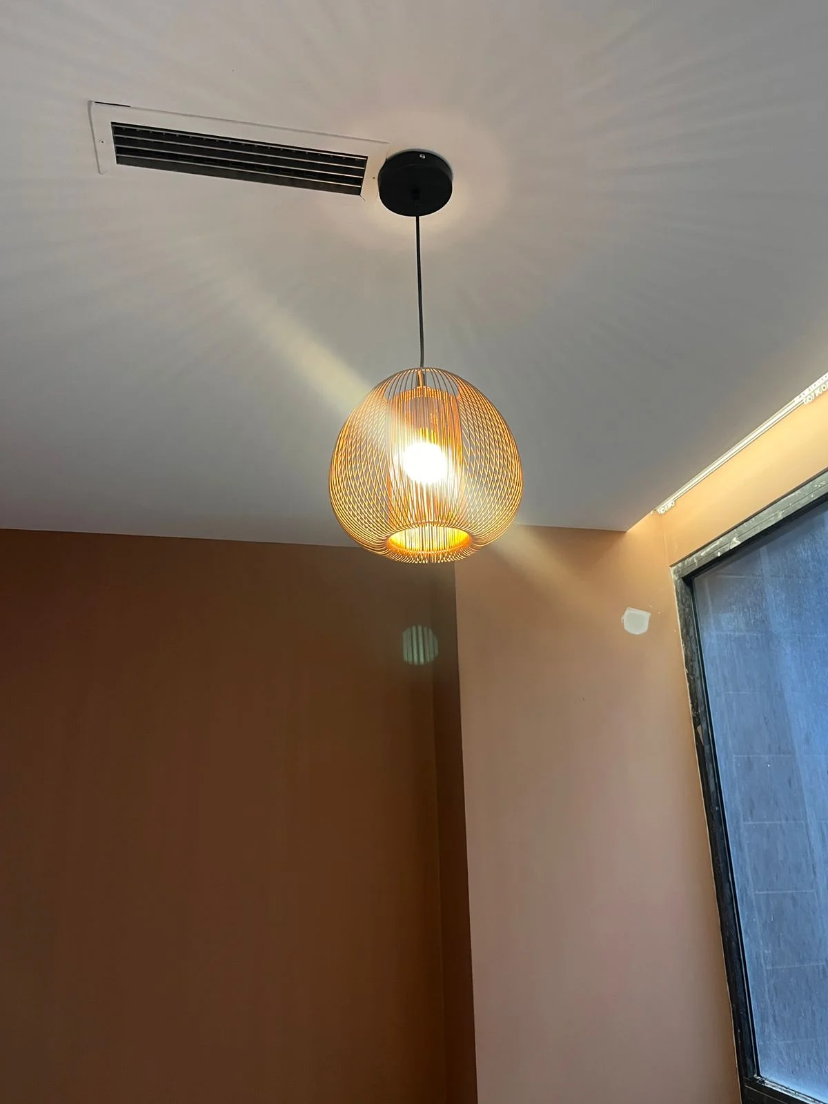 A pendant fixture hung from a gypsum ceiling: direct lighting changes how the wall color below it is perceived
For an average Albanian living room, 20 to 30 square metres, we recommend a dominant warm neutral tone on about 60% of the walls, with one deeper accent wall (navy blue, dark forest green or terracotta) on roughly 10 to 15% of the surface, following the classic 60-30-10 interior design rule.
How much paint and what sheen does each room need?
The table below summarizes practical color psychology recommendations alongside application details, so you have everything in one place when planning your painting project.
| Room | Recommended color family | Finish | Coats and drying time | |---|---|---|---| | Bedroom | Pale blue, light gray, sage green | Matte | 2 coats, 2-4 hours drying between | | Kitchen | Soft terracotta, mustard yellow, warm neutrals | Satin / semi-gloss | 2 coats, 2-4 hours drying between | | Home office | Sage green, soft blue, warm gray | Eggshell / low-sheen | 2 coats, 2-4 hours drying between | | Kids' room | Light pastels plus one accent wall | Washable satin, low-VOC | 2 coats, 2-4 hours drying between | | Living room | Warm neutrals plus one deep accent wall | Matte or matte satin | 2 coats, 2-4 hours drying between |
For every room, walls need to be properly plastered and primed before painting so the color appears uniform. If your walls have cracks or an uneven surface, professional wall plastering is the step that has to come before choosing a color, because no color looks right over an unprepared surface.
It is worth noting that this guide focuses on the psychology and specific function of each room. For more general advice on choosing paint colors, Mediterranean light and the basic rules for combining tones throughout a whole home, see our full guide on how to choose the right paint colors for your home, which covers the topic more broadly while this article goes deeper on the psychological effect room by room.
If you are also planning your home's exterior, color psychology principles apply differently to a facade compared with interior spaces, a topic we cover separately in exterior facade paint colors.
Why choose Torra Gips for painting your home?
Choosing the right color is only half the job, professional application is what secures the final result. At Torra Gips we work with the best brands on the market, Dulux, Jotun and Caparol, which offer dense pigments and formulas resistant to fading under strong Mediterranean light. With experience across more than 100 completed projects in Tirana and Durres, our team helps you choose not just a beautiful color, but the right color for your room's actual function.
Every project starts with a free on-site consultation, where we assess the room's natural light, orientation and wall condition before recommending a specific palette. If you are in the capital, our painting team in Tirana can come out for measurements and a consultation the same day.
Start today with a free color consultation
If you want to turn color psychology into a concrete plan for your home, contact us for a free on-site consultation. Message us directly on WhatsApp at +355 68 858 0058 and our team will help you choose the right color and finish for every room, from the bedroom to the living room, using quality materials and professional application.